Brief 4

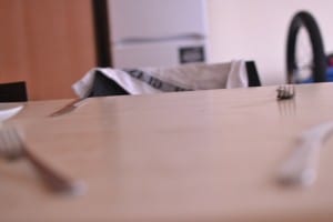
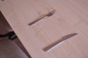
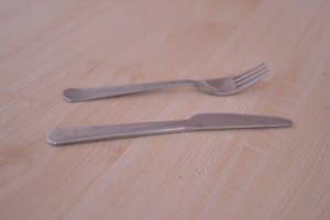
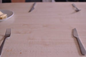
For this brief we were asked to take photos that reminded us of home and home for me has always been somewhere that has been comfortable with lots of warmth in both the use of colours and textures used in decoration but also home is familiar as I had loved in the same home for 18 years of my life therefore there are lots of items and objects and things that I can associate with home for example my firs set of photographs are representative of creature comforts and home cooking. They are such because when it came to buying kitchen utensils etc. I brought the same ones I was familiar with at home that was the focus of the image as the knifes and forks represent something comfortable to me on top of all of that it represents being at home and eating meals together as a family and spending time together as a group.

DSC_0763

DSC_0766

DSC_0769

DSC_0772

DSC_0773

DSC_0775

The next thing I think of when I think of home is lots of natural light as it represents again comfort but also when I am at home my mood is much more positive because I am comfortable I could be doing the same thing as I am doing elsewhere like tidying my room but I’d be a lot happier because their was much more natural light. Thats the feeling I was trying to achieve from the second set of photographs but having the natural light coming in but also drawing attention to such things as clothing the could indicate the mundane tasks but still can make for a few happy memories.

DSC_0754

DSC_0755

DSC_0756

DSC_0757

DSC_0759

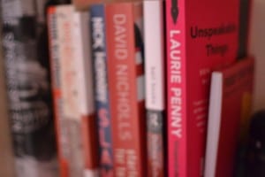
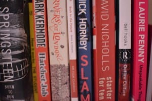
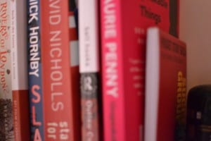
The next set of photos exist to remind me of my Dad and how as a teacher during the summers he used to spend a lot of time marking exam papers for extra money so we could as a family afford to go on holiday. Because of this he used to spend a lot of time in the office which has a large collection of books little items and trinkets, DVD’s old CD’s and tapes and something that was important to me at uni was filling the bookshelf in my room with some books and DVD’s from home so that it does feel like I brought a little bit more of home with me. Also when I think of my father I think of intelligence and important subject matters and his seemingly endless knowledge of social constructs so I wanted to emphasise in the photos the importance of some of his favourite books, some that I recommended to me and also some that I am reading due to his influence as a teacher of film but also of communication and culture.
1

2

3

4

5

6

Brief 3

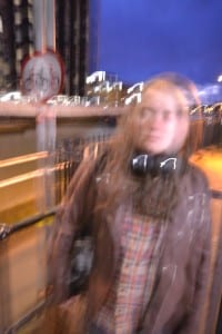
For this brief I wanted to take portraits on how people saw themselves regardless of if I new them personally or not. To do this I asked those I photographed how they see themselves and and if thats how they think others see them, I then thought about how I could translate that into a photograph. For the 1st image which is one of a stranger I saw that outside my apartment complex there was some nice lighting so waited for somebody to walk past and asked them if I could take a portrait of them. The man I asked when talking about how he would like to be seen said that he finds himself un-photogenic but likes to think that makes him somewhat unique and interesting and if he did look any different in photos it wouldn’t be representative of himself. So for the photo I wanted to bring across this serious tone he was giving off but also an element that was none traditional and confirmative to general rules of photography so what I did was I changed the shutter speed so that the image would have too much motion blur to distort the subject but I also placed them off of centre frame and added a fair amount of space at the top of the frame, by shooting in portrait over landscape, to show the interesting colour of the sky and also some other elements of the foreground which resulted in an unusual but I and he thought of as an interesting image and an accurate representation of how he wanted to be photographed. DSC_0715

For the second subjects image I photographed one of my good friends when he came up to visit me, when I communicated him about what he wanted he said that he would like a simple image that first of all made him look like himself and we both agreed that the best way to do this was to use artificial light and create it so that he seemed like how he sees himself sometimes an be fake and not all real hens the decision to not use natural light but that despite not always feeling like he’s 100% himself all the time he was still happy so I got him to laugh and took a photo of it as the fake light represents some of his anxiety towards whether he is as legitimately happy as he comes across but to the viewer and as me the photographer and his friend we see him as someone who is generally happy in that moment. Finally when editing the image I added a slight crop to the image to bring the focus into him to really draw on the importance of his expression over the lighting.
DSC_0710

For the final image which was self portrait I asked one of flatmates how they saw me and they confirmed what I wanted to be true which was that with me what you see is what you get and when I feel happy and am laughing it isn’t fake or forced so I decided to wear bright colours and also to shoot using only natural light and got one of my friends to make me laugh whilst I took the photo on a timer. In doing so I think I got a good and accurate image of my mental state which is ultimately happy and joyful occasionally cast in some darkness and vulnerability but these are all genuine feelings about how I feel within my own skin and also showing myself to the wider world. DSC_0749

Brief 2

Final Images:

1

2

3

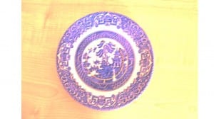
For these images I wanted to recreate a familiar feeling for the viewing and also delve into my feelings of nostalgia. By this I mean when looking at lost and found I looked at items that weren’t lost in the physical sense but more kept safe in the memory of the viewer and lost to time. I had this idea when looking around charity and antique shops and saw a few items that reminded me of my Grandmothers house and brought up old memories and so when looking at taking photographs I wanted to create a similar feeling to how the memories of such items are therefore I have added a sort of yellow/orange tinge and exposure to them to make them seem like memories. Whilst doing so I researched how people represented their memories in images and and thought about what I saw when I looked back on my past and the two most accurate images I found used a tint but also showed accurately how people are seen in our memories fortunately foe me I didn’t have to worry about that as there were no people in my photos. However as well as adding the tint I wanted to show how lighting was show how clearer more current memories where so what I did was took a photograph of a watch replicated the memory of when I found it and how that was more recent so the tinge and editing was lighter.

Brief 1

Image 2

Image 1Research:

Ad Busters:

Ad Busters is a media organisation that publish an international non profit magazine, founded in 1989 by Kalle Last and Bill Schmalz. They are advertised as anti capitalist  this is probably because of the content they produce that seems to tear down or take a satirical look open pop culture and politics and coming the two or draw and craft a new underlying message about the politics. This is what they are most commonly know for as this kind of content is  the most popular.

This relates to my first image as I have followed in the same vein but instead I have chosen to give new meaning to stock photo images by giving them new undertones by either combining more than one or another or editing the image to give a new completely new meaning to the image. This second method is what was used for my first image I have taken this image and added a thought bubble as well as a Trump Campaign badge as well as text within the bubble that reads “I didn’t think he’d actually ban them”. This is a commentary on the new bill President Trump is trying to pass that bans people from certain countries from entering America and how many of his electorates voted for him.

The second image follows this theme but is grounded less in politics but is instead more inspired by newspaper cartoons or images to accompany a column or article like you would see in the Times however I was able to keep it along with the appropriated image by now suggesting political undertones rather than placing them as the main focus of the subtext for the image. By adding new text to the sign and combining that image with that a man who is blindfold the image got a new meaning as was the brief but now its more subjective so became even more inspired by ad busters as the application to certain points become varied. You could apply it to something like Brexit and the uncertainty of the future British economy and it would become similar to a Times image or you could take at a social commentary like some of the work on the adjusters website, link bellow:

http://adbusters.org